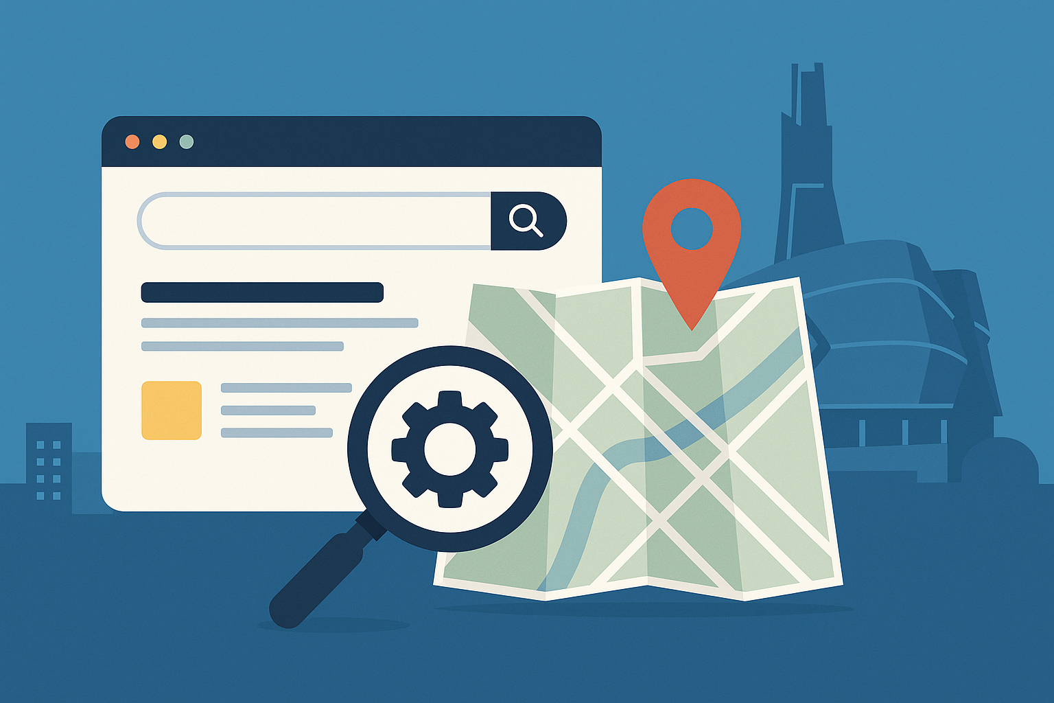
What Is Responsive Web Design?
Responsive website design is a design approach that ensures your website looks and functions well on every device-from desktop computers to smartphones and tablets. Rather than building separate versions of a site for different screen sizes, responsive design uses flexible layouts, images, and CSS media queries to automatically adjust the site’s appearance and usability.
Why Is Responsive Design So Important?
Today, more than half of all web traffic comes from mobile devices. If your website isn’t responsive, users on smartphones or tablets may experience issues like distorted layouts, unreadable text, and slow load times. These poor experiences drive visitors away and hurt your business.
Key Benefits of Responsive Design:
Improved User Experience: Visitors enjoy a seamless experience across all devices.
Higher Search Engine Rankings: Google prioritizes mobile-friendly websites in its search results.
Increased Conversion Rates: When users can navigate easily, they’re more likely to take action.
Cost-Effectiveness: Maintain one website instead of multiple versions for different devices.
Faster Page Load Times: Optimized design improves performance on mobile networks.
How Responsive Design Works
Responsive websites use a grid system that adapts to the screen size. Media queries in CSS detect the device type and apply specific styles accordingly. For example, a three-column layout on a desktop may become a single-column layout on a smartphone. Images and text scale appropriately, and navigation is optimized for touch screens.
Common Features of a Responsive Website
Flexible Grids and Layouts
Scalable Images and Media
Touch-Friendly Buttons and Menus
Readable Fonts and Proper Spacing
Optimized Performance for Mobile Browsers
Responsive Design vs. Mobile-Friendly
While “mobile-friendly” means a site functions on a mobile device, it may still display like a desktop site, but slightly smaller. Responsive design is more advanced; it fully adapts to any screen size, providing a tailored experience.
How to Know If Your Website Is Responsive
You can use Google’s Mobile-Friendly Test or simply resize your browser window to see how your site behaves. If the layout shifts smoothly, text remains readable, and navigation is easy, you likely have a responsive design.
FAQs
What is the main goal of responsive web design?
The main goal of responsive web design is to ensure a seamless and consistent user experience across all devices, including desktops, tablets, and smartphones. It helps improve usability and engagement while supporting better SEO performance.
How does responsive design affect SEO?
Google uses mobile-first indexing, meaning it evaluates the mobile version of your site first. Responsive design improves your site’s mobile usability, load times, and user experience, all of which are important ranking factors for SEO.
Is a mobile-friendly website the same as a responsive website?
No. A mobile-friendly site may work on mobile devices, but doesn’t necessarily adapt its layout to different screen sizes. A responsive website dynamically adjusts to any screen for optimal usability.
Can I make my current website responsive?
Yes. Existing websites can often be updated to use responsive design. This might involve redesigning layouts, updating code, and optimizing images, but it’s a valuable investment for better performance.
Do responsive websites load faster?
Generally, yes. Responsive websites are optimized for performance on all devices, especially mobile, which often includes techniques like image compression and streamlined coding for faster load times.
Final Thoughts: Partner With PegCity Digital Marketing
In today’s digital world, having a responsive website isn’t optional’s essential. A responsive design ensures you reach and retain users on every device, improving SEO, user engagement, and conversions.
At PegCity Digital Marketing, we specialize in creating modern, responsive websites that look great and perform flawlessly on all devices. Whether you’re building a new site or updating an old one, our team can help ensure your online presence is effective, fast, and mobile-ready. Contact us today to future-proof your website!