Why You Need Responsive Website Design for All Devices in 2025
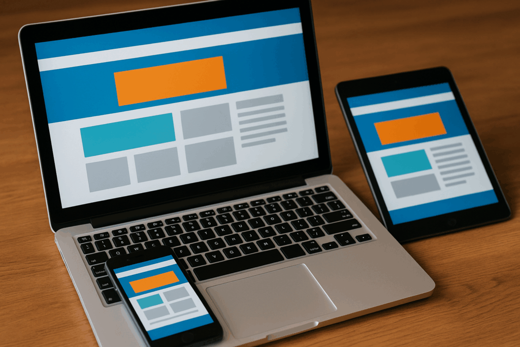
What Is Responsive Web Design? Responsive website design is a design approach that ensures your website looks and functions well on every device-from desktop computers to smartphones and tablets. Rather than building separate versions of a site for different screen sizes, responsive design uses flexible layouts, images, and CSS media queries to automatically adjust the […]
What Makes a User-Friendly Website?

In today’s digital-first world, a user-friendly website is essential for capturing attention, building trust, and driving conversions. Whether you’re a small business or a growing enterprise, your website needs to deliver an effortless and satisfying experience for visitors. But what exactly makes a website “user-friendly”? Let’s break it down. Why User-Friendly Websites Matter Before diving […]
How to Optimize Homepage for Maximum Impact
How to Optimize Homepage? Your homepage is often the first impression potential customers have of your brand. In today’s competitive digital landscape, having a polished and strategically optimized homepage can mean the difference between a bounce and a conversion. Whether you’re a small business or an established company, learning how to optimize your homepage is […]